Aesthetic Website Design: 7 Tips for Creating an Eye-Catching Website
Imagine you're wandering through an exquisite art gallery. Each displayed artwork is a unique blend of color, texture, and emotion that captivates your attention. Now, imagine your website in the same light.
It's a digital canvas where each pixel is part of a larger masterpiece designed to engage visitors and enhance their user experience.
In today's digital age, having an aesthetically pleasing website design isn't just nice-to-have—it's crucial to standing out from the competition.
So, how do you create an online stage that both catches the eye and resonates with your audience? Buckle up as we dive into seven paramount tips for designing a website infused with aesthetic brilliance that delivers remarkable first impressions.
Aesthetic website design is the process of creating and arranging visual elements on a website in a way that reflects the brand's personality, communicates its message, engages and retains visitors, and enhances the user experience.
This can be achieved through various design techniques such as color palettes, typography, layout, imagery, animation effects, parallax scrolling, and more. The goal of aesthetic web design is to create a memorable and immersive online experience for visitors that aligns with the brand's goals and values.

Principles of Aesthetic Website Layout Design
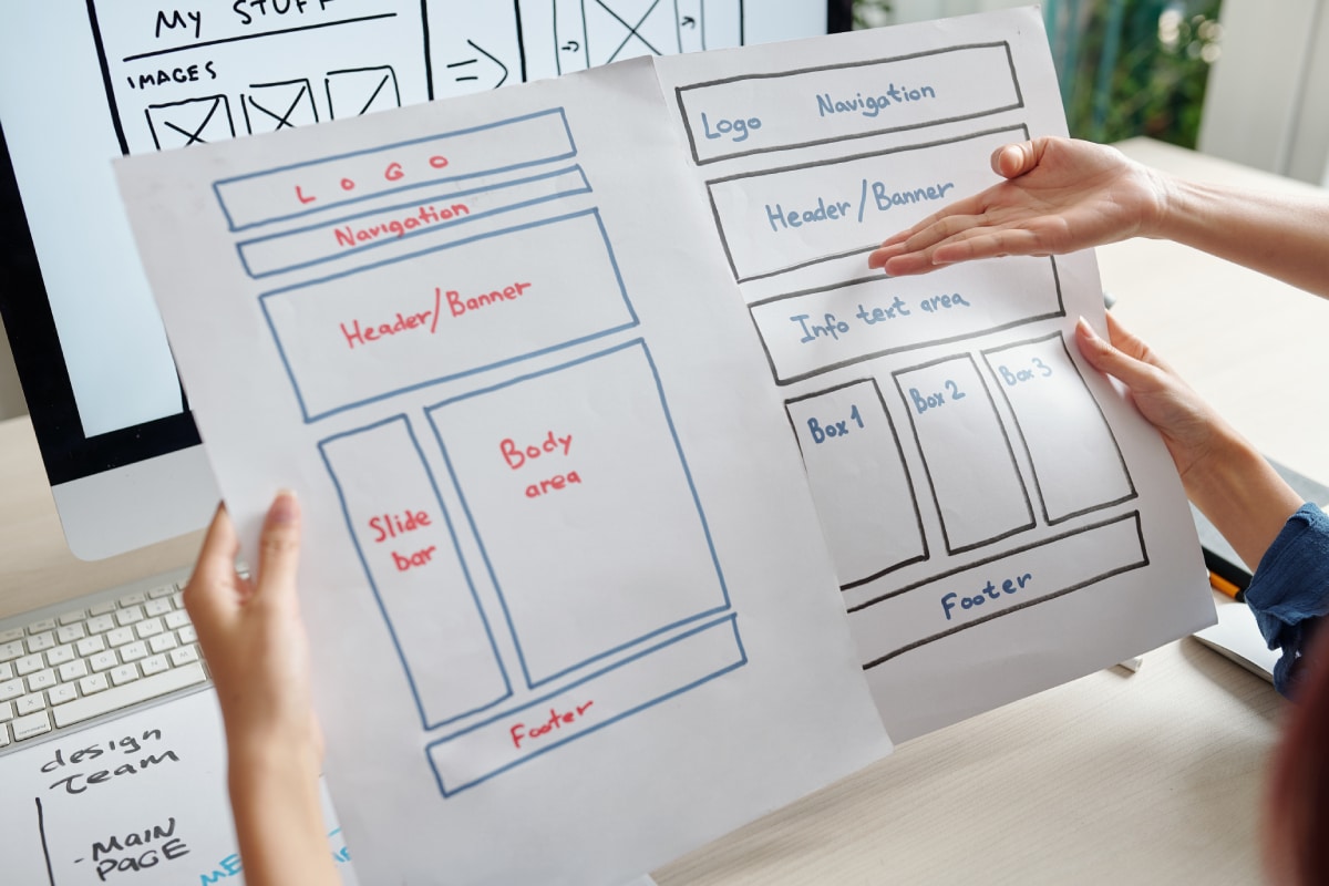
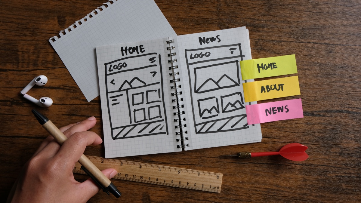
The layout of a website is the backbone of aesthetic web design. It's the visual organization of materials on a webpage - content, images, videos, and other media forms.
The layout has a significant impact on how users perceive your website. Simple and clean layouts are marginally more popular because they give users breathing room to take in the visuals. However, unique and creative layouts can attract attention and make your site stand out.
When creating an aesthetic website layout design, start with the essentials; all important materials must be readily visible at first sight without overwhelming the user experience.
One way to achieve this is by having hierarchy structures that help to break down information into chunks. With hierarchal labeling, key features stand out against less critical information, making them easier to spot.
In the digital age, consumers are spending more time online than ever before. Every part of a website’s layout should be viewable in different screen sizes.
Responsive design is crucial for modern web design because people use devices with varying screen sizes to access websites. Therefore, you must ensure that your site looks stunning on different-sized screens.
Every designer struggles to select between simplicity and innovation while designing their websites' layout. While some believe that minimalist design is key to aesthetic website design, others feel that aesthetics are better expressed when creativity is allowed to run free. However, both options come with their benefits and drawbacks.
Now that we understand what factors influence the creation of a beautiful website layout design let's explore some of essential types of layout designs in web development.
Main Types of Layout Designs
There are various types of layouts available for developing aesthetic websites. These include grid layout, full-screen layout background images, broken grid layout, single-page scrolling layout, asymmetric layout design,, modular grid layouts as well as sticky elements layout.
A grid layout is a popular type of layout design that provides users with a well-structured and fine-tuned visual experience. To achieve this, designers arrange content into rows and columns.
This allows visitors to easily navigate through the website since it helps display information clearly and concisely.
The full-screen layout with background images is another popular method of designing websites. Having high-quality images stretched to fill up the entire webpage creates a significant impact that leaves a lasting impression on visitors.
Additionally, choosing appropriate typography color combinations optimizes the written text for readability on any background color type.
Broken grid layouts are like puzzles; they allow designers to make their sites more unique by putting different pieces together. With broken grid lines, you can gain more creativity while promoting distinctiveness in your aesthetic site's design and structure.
While some experts argue that single-page scrolling layouts enhance user experience by eliminating unnecessary navigation, others think it can cause confusion among users who prefer to bounce back-and-forth between pages on the site.
By understanding these various types of layouts including the pros and cons or each one's advantages in web development, you will be able to develop an aesthetic website that stands out from the competition.
- According to a study by Adobe, nearly 38% of people will stop interacting with a website if the content or layout is unattractive.
- Google's research indicates that users form an opinion about a website's aesthetic design within 50 milliseconds.
- A survey conducted by Stanford University revealed that almost half (46.1%) of people consider the design look of a website as the top criterion for perceiving the credibility of a company or organization.
- Understanding different types of layout designs in web development is crucial for creating an aesthetic website that stands out from the competition.
Grid layouts provide a well-structured visual experience, while full-screen layouts with background images leave a lasting impression on visitors.
Broken grid layouts promote uniqueness and creativity, and single-page scrolling layouts can enhance or confuse the user experience depending on the audience. Ultimately, choosing the right layout design depends on your website's purpose and target audience.
Balance and Proportion in Design
Designers understand the importance of balance and proportion when it comes to creating an eye-catching website. Balance refers to the equal distribution of elements in a design, whereas proportion deals with how those elements relate to one another in terms of size, shape, and position.
One example of effective balance is symmetrical design. This means that the elements on one side of the page mirror those on the other, creating a sense of order and stability.
On the other hand, asymmetrical design can be equally effective when used strategically. It involves balancing out different elements based on their visual weight, so a small but bold element could balance out a larger and more subdued element.
Proper use of proportion can enhance user experience for your website visitors. Designers mustn't make any one element overpowering or too small compared to others.
This is especially important when considering typography sizes within paragraphs; if the paragraph width is too narrow or wide, it will affect readability.
Critics of proportional design may argue that strict adherence to the Golden Ratio may lead to overly predictable layouts that lose out on a creative edge.
The reality is that using ratio as a base for your layout leaves enough room for some leeway with image sizes and text placement.

Impact of Color Selection
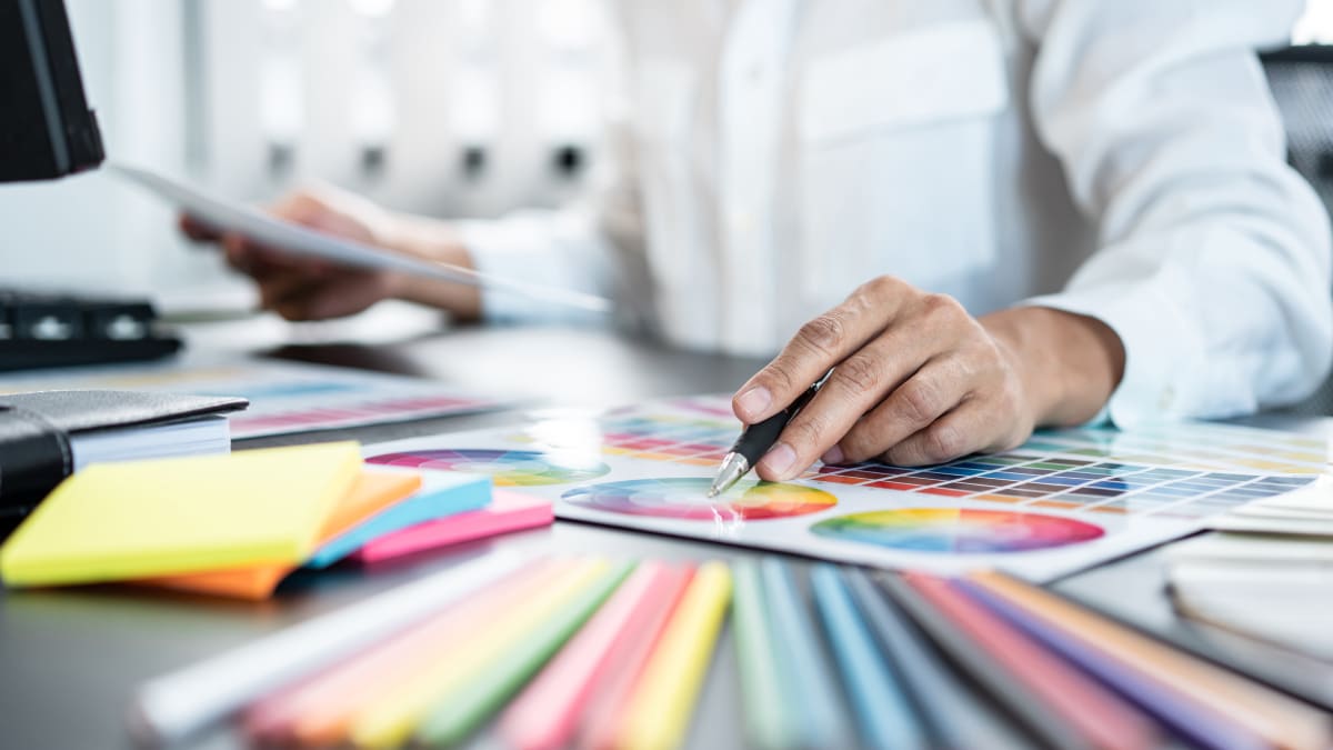
The impact of color selection cannot be stressed enough in web design, as color sets the tone and mood for the entire website. Understanding the basics of color theory helps designers select apt colors that represent brands effectively while maintaining harmony throughout all design elements.
White space or negative space helps frames content beautifully and creates a visual contrast with colored elements around them. This way, web pages appear easy to read and engage with.
Color can affect user experience, mood and emotions subconsciously. For instance, cool tones like blues and greens may instill a sense of calmness or give off an aura of reliability, while warmer colors like reds and oranges boost energy and stimulate emotional responses.
The challenge of selecting the correct color scheme arises when opposing colours are used together. Color theory advocates utilizing the color wheel for complimentary color combo ideas.
While it's tempting to mix complementary colours in a vibrant palette, smaller discrepancies should be noticed as even minute errors in shading or hue can risk appearing uncoordinated for design coherence.
It's essential to acknowledge that certain industries may have standard colour palettes; take, for instance, medical sites sticking to blue-green hues to represent tranquility and trust. At the same time, some may choose vibrant shades to show boldness or reinforce branding.
All in all, selecting colors that complement one another makes it simpler for website visitors to find information quickly and helps your site remain easy on the eyes at all times.
When combining the core principles discussed thus far, designers have top-notch tools at their disposal to make high-quality aesthetic designs that capture visitors' attention on their first visit.
Color Psychology in Web Design
Color plays a crucial role in website design as it has the ability to convey emotions, set a mood, and influence user behavior. As businesses strive to create an aesthetic website that captures the attention of visitors and drives conversions, understanding color psychology in web design can be incredibly useful.
For instance, using shades of blue on a website has been known to promote trust and reliability. This is particularly relevant for business or finance websites where users expect transparency and security.
Using red, on the other hand, can evoke excitement and urgency. This is why many e-commerce websites utilize red in their call-to-action buttons.
In fact, according to a study by the Institute for Color Research, people make a subconscious judgment about a product within 90 seconds of initial viewing and much of that assessment is based on color alone.
Therefore, choosing the right color scheme for an aesthetic website can not only enhance its visual appeal but also improve user engagement.
Choosing colors for web design is similar to painting on a canvas – picking the right combination of tones requires an eye for detail and consideration for what will evoke the desired emotional response from viewers.
With that being said, let's explore some effective ways of incorporating color into aesthetic website design.

Incorporating Engaging Visuals and Graphics
Using engaging visuals and graphics on an aesthetic website can help convey its message effectively while capturing visitor attention. But how does one find the right balance between text and imagery?
While it is important to have attractive visuals on your website, it should not come at the cost of user experience. When adding graphics or images to a website, it is critical to be conscious of page loading times.
Large image sizes can create slow loading times that negatively impact user engagement. In addition, it is essential to use high-quality images that are relevant to the content being displayed.
High resolution images help to showcase a brand's professionalism, while inappropriate images can detract from the website's overall aesthetic. Additionally, incorporating icons instead of text can make the website visually appealing and easier to navigate.
Take for example the website of an online interior design business - incorporating a gallery of visually appealing images of rooms they have designed can create a lasting impact in a customer's mind, leading to higher rates of customer satisfaction and conversion.
Therefore, when incorporating visuals and graphics on an aesthetic website, one should always consider their relevance, quality and loading times. A successful balance between text and imagery can create an optimal user experience and lead to higher conversions.
The Role of Images and Icons
One of the key elements of aesthetic website design is the use of high-quality images and icons. These visual elements help to create an emotional connection with site visitors, and can also serve practical purposes, such as guiding users through the site's navigation.
For example, consider a website for a travel agency that uses stunning images of exotic locations around the world. These images can help sell the idea of taking a dream vacation to potential clients, while also showcasing the company's expertise in travel planning.
It is essential when using images that they are high-quality and purposeful. Images should be sized appropriately so they do not slow down page loading times or overwhelm other design elements on the page. Additionally, images should be compressed before uploading to optimize their speed while maintaining image quality.
While using images can greatly enhance the aesthetics of a website, it is important to ensure they are optimized for search engines by including alt text and descriptive file names.
Alt text provides context for screen readers and search engines, allowing them to understand what is in the image.
An appropriate analogy for using images in web design would be like decorating a room - you want to add enough decoration to make it feel inviting and welcoming, but not overdo it to where it feels cluttered and overwhelming.

Enhancing User Interface with Typography and Interactivity
Another crucial element in aesthetic website design is typography and interactivity. Typography involves selecting font styles, sizes, and colors that complement other design elements on the page.
Interactive features such as animations, hover effects, and scroll-triggered events create engagement with site visitors and can also aid in user navigation.
For instance, consider a homepage slider section featuring a beautiful header image overlaid with bold typography introducing your product or service. This not only draws a viewers attention but intrigues them to learn more about your brand, mission and services.
Careful consideration when selecting font families and styles can greatly enhance the readability of website content. Additionally, designers should ensure that fonts are scaled appropriately for different devices to optimize legibility on both mobile and desktop screens.
While interactivity can greatly enhance the user experience when used properly, it is important not to overdo it with too many distracting animations or transitions that may negatively impact site performance or user experience.
A good analogy for typography and interactivity in web design would be like choosing the right outfit for an event - you want it to be visually appealing, fit the occasion, and be comfortable enough to wear throughout the day or night.
Selecting Appropriate Font Styles and Sizes
When it comes to website design, selecting appropriate font styles and sizes is crucial to enhancing the user interface and readability of the website.
Typography can set the tone for the entire design, and one of the biggest mistakes website owners make is overlooking this aspect of their website.
For instance, imagine a website with a font that is too small or difficult to read. The user would immediately lose interest in engaging with the content.
On the other hand, if the font is too large, it could overwhelm users and cause them to leave the site. Finding a balance between legibility and aesthetic appeal should be a top priority for every website owner.
Beyond just selecting an appropriate size and style, it is important to also consider various design elements when choosing fonts.
Color scheme should be taken into account because it impacts contrast and legibility. A high-contrast font against a contrasting background will provide maximum legibility, while low-contrast colors may strain readers' eyes.
Another consideration when selecting font styles is how they pair with each other. Websites that utilize multiple fonts must ensure visual consistency throughout their content.
Pairing fonts together that have complementary characteristics will create unity in design. There are also debates about incorporating custom fonts into a website's design versus standard web fonts. Some argue that custom fonts offer more flexibility in design and can add an element of creativity.
However, using non-standard typefaces can impact load time of a website page and potentially cause compatibility issues across different browsers and devices.
Instead of debating which approach is better, it's best to remember that form should always follow function in web design. While custom fonts might be aesthetically pleasing, they must not compromise legibility or negatively impact page speed.
Choosing appropriate font styles and sizes can be likened to choosing outfits. The right size can complement a person's body shape, while the right match of clothing style and color can accentuate a person's physical features.
Applying the same thinking to website design, the size and style of fonts used must complement the layout and color scheme in order to create a cohesive design that is easy on the eyes and helpful for users.
In conclusion, typography plays an important role in website design, impacting not just appearance but also user experience.
Careful consideration must be given to selecting appropriate font styles and sizes to achieve both aesthetic appeal and legibility. By following best practices for typography, website owners can further improve the overall impact of their site's design.

